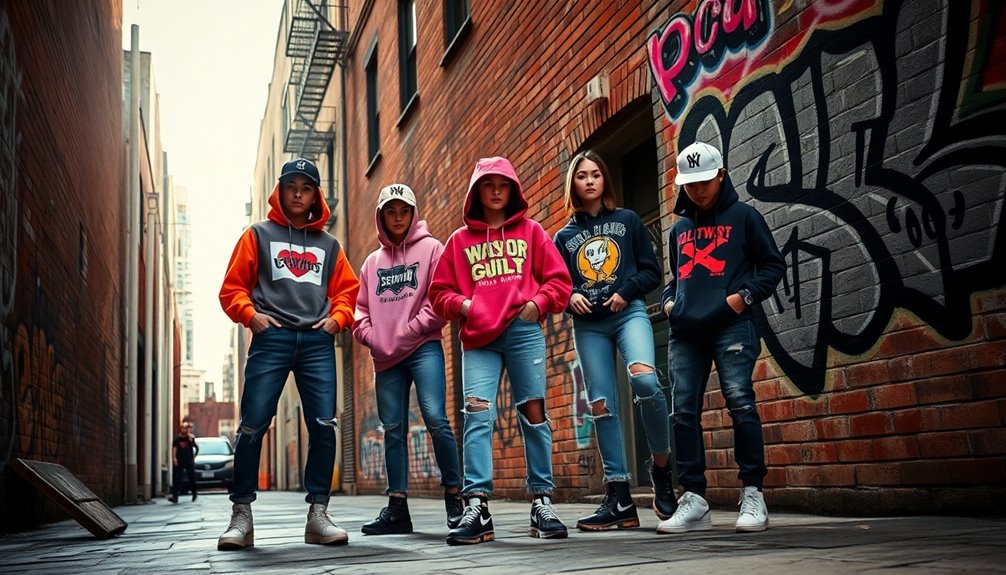

To make your graphic pieces look more grown-up, focus on refined simplicity by choosing a sophisticated color palette with muted tones, deep blues, and neutrals. Opt for clean, modern fonts like Helvetica or Futura, using minimal ornamentation. Make certain proper spacing and pairing to enhance readability and clarity. Keep designs sleek and intentional, avoiding clutter or overly bright colors. If you want to discover how subtle adjustments can elevate your work further, keep going for expert tips.
Key Takeaways
- Use a cohesive color palette with muted, earth tones or jewel shades to convey sophistication.
- Select clean, minimal fonts like sans-serif options for a modern, professional look.
- Limit the number of colors and fonts to maintain clarity and elegance.
- Incorporate ample spacing and balanced typography for readability and refinement.
- Avoid bright, playful elements; focus on subtle, mature design details.
If your graphic pieces feel too playful or youthful, there are simple ways to elevate their look and make them appear more sophisticated. The key lies in refining your color palette and carefully selecting your fonts. A mature design doesn’t need to be dull; instead, it should exude confidence and clarity. When choosing your color palette, opt for muted tones, earth shades, or classic neutrals. Bright, neon colors or overly pastel combinations often evoke a sense of fun or innocence, which might undermine the grown-up vibe you’re after. Instead, consider a palette with deep blues, sophisticated grays, warm beiges, or rich jewel tones. These colors can add depth and elegance without overwhelming the viewer. Keep your palette limited—too many colors can clutter the design and dilute its impact. A simple, cohesive set of hues will make your graphic feel more intentional and polished. Additionally, understanding color psychology can help you select hues that communicate the desired tone and professionalism effectively.
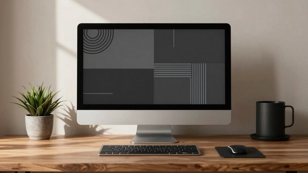
Font selection is equally essential when aiming for a more mature look. Play around with typefaces that have clean lines, minimal ornamentation, and a professional feel. Sans-serif fonts like Helvetica, Futura, or Avenir often convey modernity and sophistication, especially when used with ample spacing and proper sizing. If you prefer serif fonts, choose classic options like Garamond, Baskerville, or Times New Roman, but use them sparingly and with restraint. Avoid overly decorative or whimsical fonts, as these tend to communicate playfulness rather than professionalism. Consistency is key: stick to one or two fonts throughout your design to maintain harmony and avoid visual chaos. Pairing a bold, simple font for headings with a more subdued body font can create a refined look that’s both engaging and mature.
Learn To Write Helvetica: Learn letters by drawing them directly from the fonts that made design history
As an affiliate, we earn on qualifying purchases.
As an affiliate, we earn on qualifying purchases.
Frequently Asked Questions
What Color Palettes Are Best for a Mature Look?
For a mature look, opt for muted, sophisticated color palettes like navy, charcoal, beige, and deep greens. Focus on color pairing that creates a balanced, refined mood, avoiding overly bright or neon shades. Incorporate neutral tones with subtle pops of richer hues to evoke elegance. This thoughtful approach enhances your design’s mood creation, making your graphic pieces feel more polished, professional, and grown-up.
How Can Typography Influence a Grown-Up Aesthetic?
Typography influences a grown-up aesthetic by establishing clarity and sophistication. You can achieve this through effective typography hierarchy, guiding viewers smoothly through your message, and employing refined font pairing strategies that balance elegance and readability. When you choose classic fonts like serif or minimal sans-serifs, you subtly convey maturity. Coincidentally, these choices mirror the understated confidence of a grown-up style, making your graphic pieces appear more polished and intentional.
Should I Incorporate Minimalism or Complexity?
You should lean toward minimalism, but incorporate abstract textures and vintage patterns to add sophistication. Keep your design simple with clean lines and ample whitespace, allowing key elements to stand out. Use subtle vintage patterns for a timeless feel, and add abstract textures to create depth. This balance between minimalism and intricate details elevates your graphic pieces, making them look more polished and mature without feeling cluttered or overwhelming.
What Graphic Styles Tend to Appear More Sophisticated?
Think of vintage textures and bold patterns as your secret ingredients for sophistication. They add depth and personality, much like a well-aged wine enhances a meal. Incorporate subtle vintage textures for a timeless feel, and choose bold patterns sparingly to create impact. These styles signal confidence and maturity, making your designs stand out as refined and polished. When used thoughtfully, they elevate your work and appeal to a more grown-up aesthetic.
How Do I Balance Creativity With Professionalism?
You balance creativity with professionalism by maintaining branding consistency across your designs, ensuring your visual elements align with your brand identity. Use a clear visual hierarchy to guide viewers’ attention smoothly, combining innovative ideas with polished execution. Experiment within these boundaries to keep your work fresh yet credible. This approach helps your graphic pieces stand out while conveying a mature, professional image that builds trust and recognition.

60Pcs Transparent Color Palette Sticker Waterproof Aesthetic Sticker Bag for Notebook, Diary, Scrapbook, Mobile Phone, Water Bottle Skateboard Party Gifts, Classroom Rewards DIY Decorations
Product Quality: These stickers are made from premium PET material that is durable and has optimal adhesion. Even…
As an affiliate, we earn on qualifying purchases.
As an affiliate, we earn on qualifying purchases.
Conclusion
To make graphic pieces look more grown-up, focus on sophisticated color palettes, clean layouts, and minimalistic design. For instance, a startup rebranded with muted tones and sleek typography, shifting from playful to professional, gained credibility and attracted high-profile clients. By refining your design choices and embracing simplicity, you’ll project confidence and maturity. Remember, subtlety often speaks louder than loud visuals—your graphics should communicate sophistication without overwhelming.

New Beginnings Notebook – Minimalist Sans-Serif Font Design, Perfect for Fresh Starts and Life Changes
Premium Quality Paper: Features 112 pages of high-quality 100 gram paper, ideal for a variety of artistic mediums…
As an affiliate, we earn on qualifying purchases.
As an affiliate, we earn on qualifying purchases.

Complete Manual of Typography, The: A Guide to Setting Perfect Type
As an affiliate, we earn on qualifying purchases.
As an affiliate, we earn on qualifying purchases.