Warm tones are perfect for embracing fall color trends this season. Think deep oranges, rich reds, golden yellows, and earthy browns that evoke warmth and nostalgia. These colors create inviting spaces, whether in your home or in design projects. Pairing vibrant hues with muted neutrals adds balance and sophistication. Add hints of blue or green for depth. If you’re curious about specific applications and how to effectively mix these shades, there’s more exciting inspiration waiting for you!
Key Takeaways
- Embrace deep oranges, rich reds, and golden yellows to evoke warmth and comfort in your fall designs.
- Incorporate earthy browns to ground your color palette in nature and enhance emotional connections.
- Use muted tones alongside vibrant colors for stability and visual interest in your fall-themed spaces.
- Balance warm tones with neutral colors like cream and soft greys for a cozy yet sophisticated look.
- Consider luxurious shades like Italian Plum and deep wine reds to elevate your fall color schemes.

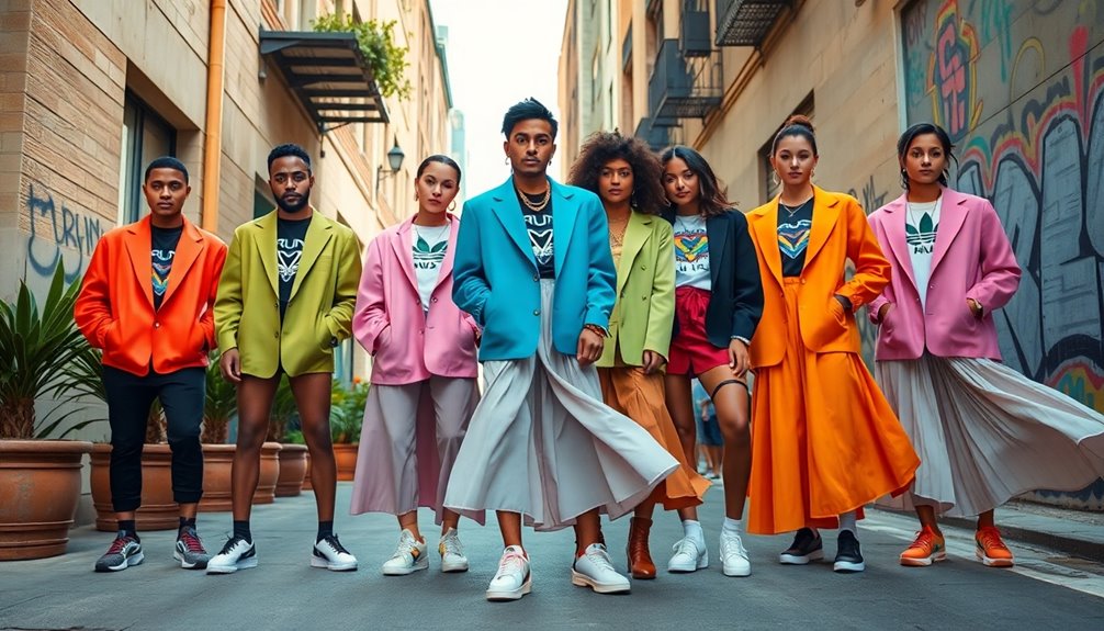
As the leaves turn and the air gets crisp, you might find yourself drawn to the warm tones of fall color trends that evoke feelings of comfort and nostalgia. Deep oranges, rich reds, golden yellows, and earthy browns create a cozy atmosphere, perfect for embracing the season. These colors draw inspiration from nature, connecting you to the beauty of autumn landscapes and the warmth of familiar memories.
Incorporating these warm tones into your designs can greatly enhance their emotional impact. For instance, golden yellows add vibrancy and cheerfulness, making spaces feel more inviting. Rich reds convey luxury and warmth, perfect for creating an elegant touch in any setting. Meanwhile, deep oranges serve as the quintessential fall color, wrapping your designs in a warm embrace, while earthy browns ground your palette, connecting it to nature.
Incorporating warm tones enhances emotional impact, inviting vibrancy and elegance while grounding designs in nature’s beauty.
Using muted tones alongside these vibrant shades provides stability, allowing for a harmonious balance. To create effective designs, it’s essential to mix these warm tones with neutral colors like cream, beige, or soft greys. These neutrals act as a backdrop, allowing the vibrant fall colors to shine without overwhelming the viewer.
Balancing warm and cool colors, such as incorporating hints of blue or green, can add visual interest and depth, making your designs more engaging. Looking ahead, Pantone’s Color of the Year for 2025, Mocha Mousse, embodies the rich, comforting essence of cocoa and chocolate, making it a perfect fit for fall color palettes.
Darker, luxurious shades like Italian Plum and deep wine reds, like Scarlet Smile, elevate your designs, while softer shades like Fern can create a soothing atmosphere. Using these colors thoughtfully can enhance your branding, making your identity resonate with warmth and comfort. Additionally, regularly updating plans can ensure your design approach remains relevant and reflects current trends.
In interior design, warm tones create inviting spaces that encourage relaxation and connection. Whether you’re revamping your home or working on a business setting, these colors can make a notable difference in how people feel. Using fall colors in packaging design can also catch the eye, making products more appealing on the shelves.
Frequently Asked Questions
What Materials Pair Best With Warm Fall Colors?
To enhance warm fall colors, you can pair rich wood tones like walnut and mahogany with natural stone elements such as granite.
Incorporate textiles like velvet upholstery and wool blankets for added texture and warmth. Use woven baskets and terracotta pots to bring in rustic charm.
Warm lighting fixtures and candles will create a cozy atmosphere, while seasonal florals and pumpkins add vibrant touches to your decor, perfectly complementing those autumn hues.
How Can I Incorporate Warm Tones Into My Home Decor?
You might think warm tones are too bold for your space, but they can actually create a cozy atmosphere.
Start by adding warm-colored furniture, like a rust orange sofa or mustard yellow accent pieces.
Paint your walls in earthy tones or choose warm-toned art.
Incorporate soft textiles like blankets and pillows in shades of red or gold.
Finally, use warm lighting to enhance the inviting feel, making your home a snug retreat.
Are Warm Tones Suitable for All Skin Types?
Warm tones aren’t universally suitable for all skin types. If you have warm undertones, these hues will likely enhance your natural glow.
However, if your skin has cool or neutral undertones, warm colors might clash and create an unflattering look. It’s essential to take into account your specific undertones when selecting shades.
Experimenting with earthy tones and warm colors can help you find which ones complement your complexion best. Don’t hesitate to seek personalized advice!
What Accessories Complement Warm Color Palettes?
When you’re looking to complement warm color palettes, consider choosing accessories in earthy browns, sunset oranges, and rich reds.
Incorporate golden accents for a touch of luxury, and don’t forget olive greens to balance your overall look.
Wooden pieces or leather handbags in warm tones can add a natural vibe, while knitwear in earthy shades brings cozy warmth.
Opt for nature-inspired jewelry to complete your outfit with style and elegance.
How Do I Transition Warm Tones From Fall to Winter?
To shift warm tones from fall to winter, start by layering your favorite pieces. Incorporate heavier fabrics like wool or fleece to keep warm.
Use earth tones like browns and maroons as your base, then add rich jewel tones for pops of color. Mix textures for visual interest, and accessorize with warm scarves, hats, and gloves.
This approach not only keeps you cozy but also maintains your style through the colder months.
Conclusion
As the leaves transform into a tapestry of warm hues, let your wardrobe reflect the beauty of this seasonal shift. Embrace the golden yellows, rich oranges, and deep reds like a painter with a fresh canvas, creating your own masterpiece. Just as the trees shed their summer attire, don’t hesitate to swap your cool tones for these inviting shades. Immerse yourself in the warmth of fall, and let your style bloom like nature’s vibrant display, capturing the essence of the season.