
Mastering the art of color coordination in outfits is key to creating stunning looks. Start with primary and secondary colors as a foundation. Use neutral tones for versatility and pair them with vibrant accessories for that perfect pop. Opt for complementary or analogous colors to achieve balance and harmony. Experiment with shades and textures to reflect your personality. Discover unique touches that can elevate your outfits further—there’s so much more to explore!
Key Takeaways
- Understand color basics by recognizing primary, secondary, and tertiary colors to create a balanced palette for your outfits.
- Use color harmony techniques, such as complementary and analogous colors, to achieve visually appealing combinations.
- Build a versatile wardrobe with neutral colors that easily pair with brighter shades for various occasions and seasons.
- Incorporate pops of color through accessories to enhance your outfits without overwhelming the overall look.
- Add unique touches, like metallics or nature-inspired colors, to reflect your personal style and elevate outfit appeal.
When you step into your closet, understanding color coordination can make all the difference in how your outfits come together. The color wheel is your best friend here, offering a visual guide to the relationships between colors. At its core, the wheel features primary colors—red, blue, and yellow—that can’t be created by mixing others.
Then there are secondary colors like green, purple, and orange, formed by combining two primaries. Tertiary colors, such as blue-green or yellow-orange, add variety and depth to your wardrobe, expanding your options considerably.
As you explore color combinations, consider hues, tints, shades, and tones. You can modify colors by adding white for tints, black for shades, or both for tones. This flexibility helps achieve the right intensity and contrast in your outfits, which is vital for visual appeal.
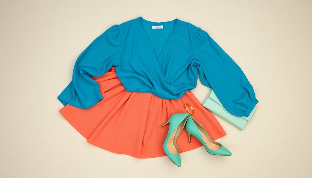
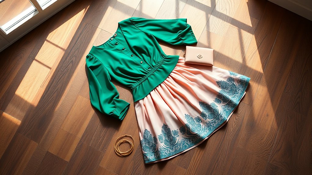
Think about color harmony, too. You can create a cohesive look using analogous colors (next to each other on the wheel) or go bold with complementary colors (opposite each other). Triadic combinations, spaced evenly on the wheel, offer a vibrant balance that’s hard to resist.
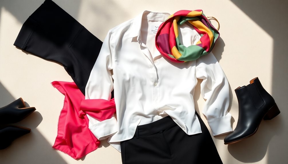
Building a versatile wardrobe starts with neutral colors like black, white, gray, beige, and navy. These shades provide a flexible base that can adapt to various seasons and occasions. You can easily pair neutrals with bright or bold colors to create striking looks.
When selecting neutrals, think about how they complement your skin tone, ensuring you’re always putting your best foot forward.
Now, don’t forget to play with contrast and harmony. Pairing light and dark colors enhances visual interest, while ensuring that the colors you choose have similar undertones maintains a cohesive appearance.
Using accessories to introduce pops of color can also spice things up. A vibrant scarf or belt can tie your outfit together without overwhelming it.
Adjusting your accessories based on the season adds another layer of versatility. For instance, in summer, opt for bright hues, while winter calls for deeper tones. Bags and shoes should either complement or contrast with your clothing, enhancing the overall look.
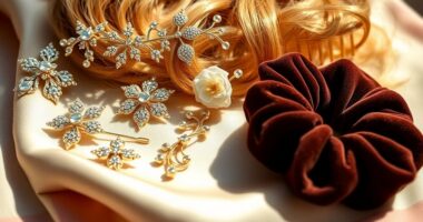
Finally, consider incorporating metallic accents for added sparkle, or choose colors inspired by nature to bring an invigorating touch to your wardrobe.
Frequently Asked Questions
How Do I Choose Colors for Different Seasons?
Choosing colors for different seasons involves understanding the palette that suits you best.
For spring, opt for light pastels and soft neutrals; in summer, go for bright colors with blue undertones.
Autumn calls for warm, rich earth tones, while winter is perfect for deep, cool colors.
Always consider your skin tone, and don’t forget to complement your outfits with the right jewelry to enhance your overall look.
What Tools Can Help Me Visualize Color Combinations?
Imagine standing before a vibrant canvas, your wardrobe waiting to be painted with color.
To visualize stunning combinations, you can use interactive color wheels like ImageToColor, which offer real-time previews. Tools like Colorwise.me help you analyze your personal palette by uploading photos, while Adobe Color generates trendy palettes tailored for you.
These resources empower you to play with hues, ensuring every outfit you create feels harmonious and uniquely you.
Are There Color Coordination Rules for Different Body Types?
Yes, there are color coordination rules tailored for different body types.
For apple-shaped bodies, use brighter colors on the top and bottom while opting for darker shades on the upper body.
If you’re pear-shaped, focus on bright colors for the upper half and darker tones below.
Hourglass figures should emphasize the waist with bright colors, while rectangular shapes benefit from uneven color distribution.
Experimenting with these rules can create a flattering, balanced look.
How Can I Incorporate Patterns With Color Coordination?
To incorporate patterns with color coordination, start by choosing a dominant pattern and a secondary one that complements it.
Use analogous colors for a harmonious look or contrasting colors for visual interest.
Make sure to balance bold patterns with neutral pieces to avoid overwhelming your outfit.
Mixing textures can also add depth.
Finally, stick to a common color throughout the patterns to tie everything together seamlessly, creating a cohesive and stylish appearance.
What Are the Best Color Combinations for Professional Settings?
Imagine walking into a room where every eye is on you.
For professional settings, you can’t go wrong with classic combinations like navy blue paired with crisp white. Dark gray offers a sleek backdrop for brighter accents, while black remains timeless.
You’ll find that adding subtle textures enhances your look.
Conclusion
In the world of fashion, mastering color coordination can feel like painting a masterpiece; each hue plays an essential role in creating a stunning visual harmony. When you confidently blend colors in your outfits, you not only express your personality but also elevate your style to new heights. So, embrace the palette of possibilities, experiment with shades, and let your outfits reflect the vibrant canvas of who you are. After all, life’s too short for dull colors!