To make your graphic pieces look more grown-up, focus on refined typography by choosing elegant serif or sleek sans-serif fonts and keeping it simple with one or two styles. Pay attention to spacing, alignment, and visual hierarchy to create balance and clarity. Use a sophisticated color palette and balanced composition to evoke a mature feel. Implementing these design principles will elevate your work and help you achieve a polished, professional look—more tips await as you continue exploration.
Key Takeaways
- Use elegant serif fonts combined with minimal sans-serif accents for a sophisticated, modern look.
- Maintain consistent spacing and alignment to create a polished, balanced design.
- Incorporate a refined color palette with muted or neutral tones to evoke maturity.
- Establish a clear visual hierarchy through size, placement, and subtle emphasis on key elements.
- Prioritize clean composition and avoid clutter to convey professionalism and restraint.

Ever wondered how to elevate your graphic designs to look more polished and sophisticated? It’s all about the details—particularly your typography choices and color palette selection. When you aim for a more grown-up aesthetic, you want your designs to communicate maturity and confidence without seeming overly complicated or trendy. Choosing the right typography is the first step. Opt for clean, elegant fonts that are easy to read and avoid playful or overly decorative styles. Serif fonts often add a touch of class and tradition, while modern sans-serifs can bring a sleek, contemporary vibe. The key is to keep your typography consistent and balanced throughout your piece. Limit yourself to one or two font styles to maintain cohesion, and pay close attention to spacing, size, and alignment. Proper kerning and line height make a big difference, ensuring that your text looks refined rather than cluttered or amateurish. Additionally, understanding content in design can help you make more informed decisions that enhance overall professionalism. A strong grasp of typography principles allows you to refine your choices and communicate your message more effectively. Incorporating visual hierarchy techniques can further improve the clarity and impact of your graphic pieces. When you understand how content influences perception, your designs can better evoke the desired emotional response from your audience. Furthermore, paying attention to composition and balance can help create a cohesive and polished look that resonates with a mature audience.
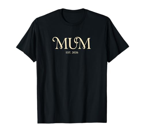
Minimalist Mum Established 2026 Serif Font Tee T-Shirt
An elegant graphic marking the milestone of becoming a "MUM" in 2026. Perfect for a first Mother's Day…
As an affiliate, we earn on qualifying purchases.
As an affiliate, we earn on qualifying purchases.
Frequently Asked Questions
What Color Schemes Are Most Effective for a Mature Look?
You should opt for subdued, sophisticated color schemes like monochrome palettes or muted tones to achieve a mature look. Incorporate strong color contrast carefully to add depth without overwhelming the design. Avoid bright, neon colors, and instead focus on palettes that evoke elegance and restraint. Using these strategies, your graphic pieces will appear more polished, professional, and aligned with a grown-up aesthetic.
How Can Typography Influence the Perceived Professionalism of a Graphic?
Typography markedly influences the professionalism of your graphic by emphasizing clarity and sophistication. You should focus on effective font pairing to create harmony and contrast, making your message easy to read. Additionally, hierarchy design guides viewers’ attention, highlighting key information and establishing a refined structure. When you choose appropriate fonts and organize content thoughtfully, your graphic appears more polished, mature, and credible—perfect for a grown-up, professional look.
Are There Specific Design Trends to Avoid for a Grown-Up Aesthetic?
Don’t throw the baby out with the bathwater; steer clear of playful fonts and bright patterns that scream casual or juvenile. These design trends can undermine a grown-up aesthetic, making your work seem less professional. Instead, opt for muted color palettes, clean lines, and classic typography. By avoiding overly whimsical elements, you create a sophisticated, polished look that resonates with maturity and credibility, embodying the adage, “Less is more.”
How Do Minimalism and Complexity Impact Adult-Oriented Graphics?
Minimalism in adult-oriented graphics emphasizes clean lines and simple color schemes, making abstract layering and textured backgrounds feel sophisticated rather than cluttered. Complexity can add depth, but if overdone, it risks appearing childish. Striking a balance involves using subtle textures and layered elements thoughtfully, ensuring the design remains elegant. You want your graphics to communicate maturity, so avoid overwhelming details and focus on refined, understated compositions that highlight these design features.
What Common Mistakes Make Graphics Appear Childish or Unprofessional?
You often make graphics appear childish or unprofessional when you use playful fonts and bright backgrounds without balance. Overusing playful fonts can seem immature, and bright backgrounds might overwhelm or distract viewers. A common mistake is neglecting simplicity—cluttering your design makes it look less refined. Instead, choose clean, sophisticated fonts and muted backgrounds, maintaining balance and clarity. This approach helps your graphics look more polished and grown-up.

Hex Color Palettes: 200 Curated Color Combinations for Branding, Coding & Design
As an affiliate, we earn on qualifying purchases.
As an affiliate, we earn on qualifying purchases.
Conclusion
By refining your graphic pieces with sophisticated colors, clean lines, and minimal clutter, you elevate your work from playful to polished. Remember, the secret isn’t in the complexity but in the restraint—less truly is more. Think of your design as a well-tailored suit; it’s not about flashy details but how seamlessly everything fits together. So, next time you create, ask yourself: is this piece speaking with maturity or just making noise?

Monem Art Vintage Typography Poster – Retro Funny Print – Get Naked, Just Kidding, Joke, Humor, Minimalist – Gift for Artist, Friend – Wall Decor for Bathroom, Restroom, 11×14 White Framed
✅UNFRAMED PRINTS: We create all our prints in variation of standard sizes from 8×10 to 24×32 inches. For…
As an affiliate, we earn on qualifying purchases.
As an affiliate, we earn on qualifying purchases.

Mr. Pen- House Plan, 3 pcs, Interior Design and Furniture Templates, Clear Flexible Plastic, Drafting Tools, Ruler Shapes for Architecture, 1/4 Inch Scale, Kitchen, Bath, Bedroom, Office, Living Room
3 Pc Architect Drawing And Interior Design Template Set (Scale: 1/4 Inch = 1 Ft): House Plan Template,…
As an affiliate, we earn on qualifying purchases.
As an affiliate, we earn on qualifying purchases.